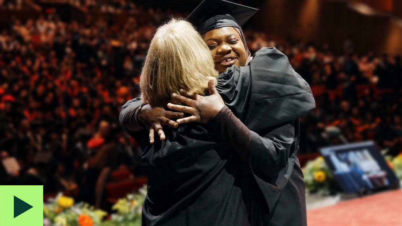
Text size:   A   A   A 

VCC Logo Guidelines

THE FOLLOWING DESCRIBES THE TERMS ON WHICH VCC MARKETING OFFERS YOU ACCESS TO OUR LOGOS. BY SELECTING THE "I ACCEPT THE GUIDELINES" AND CLICKING THE "NEXT" BUTTON, YOU ACCEPT THE TERMS AND CONDITIONS BELOW.

STEP 1: Guidelines


The logo and corresponding artwork for Vancouver Community College have been carefully designed and produced. Therefore, it is important only the official Vancouver Community College identity mark be used in media applications.

Any attempts to re-create art by scanning, tracing, etc., will result in inconsistencies that compromise the look, thus weakening effectiveness. Rescanning art from a printed piece is not permitted.

Name

The school should be referred to as VANCOUVER COMMUNITY COLLEGE or by its acronym VCC.

  • Do not refer to the institution as Van City College, Van Community or by any other convention.
  • Set the name in a font consistent with the surrounding text.
  • Do not bold, enlarge, italicise, or underline the name Vancouver Community College for emphasis. When possible, keep the college name on one line.


Logo requirements and restrictions

We have one unique logo, which may not be modified or adapted. Variations for an internal organization, promotion, concept, event, or project are not permitted.

The VCC logo must always be rendered from a high-quality sharp image (technically, a vector file). Logos copied from VCC or other websites are not acceptable.

  • Do not distribute the VCC logo to colleagues without the accompanying guidelines.
  • Vancouver Community College's standard logo is horizontal; it is our main visual identifier and a critical part of fostering public recognition and brand awareness.
  • All VCC materials - including forms, flyers, posters, information sheets and notices, for instance - must bear the VCC logo, used in accordance with these guidelines.

Identity mark and safe areas

Elements, such as typography, other logos should not intrude upon the logo's safe area. The safe area is to be 1/4" all the way around the logo. In addition, do not place the logo too close to a folded, bound or cut edge in any design application. Maintain at least 1/4" from the fold, gutter or cut edge.

  • The location of the logo on the page depends on the medium.
  • In most print applications, position the logo in the bottom right corner.
  • On the Web, the logo is placed in the top left corner.

Typefaces

Logo font is Signa Column Bold
Font has been angled 7% to match angle of logo. Do not alter the identity mark typefaces.

Note: The logo should never appear boxed in a grey area. In the illustration shown, the grey box is used only to show the required safe area. The safe areas should always be free from any elements.


Logo Size
  • The logo size is determined by the layout grid.
  • For 8 1/2" x 11" portrait layout, the logo width is 2".
  •  
  • For non-standard page sizes (e.g. 6 3/4" x 11"), the logo size is calculated by dividing the page's diagonal measurement by 6. This will yield the value of 'X'.

  • Best Practices

    The minimum logo size should not be less than 1 1/2".


    Logo Colours

    Whenever possible, the identity mark should be used in the 2-colour form. The preferred colours are PMS 5545 green and PMS black. If the logo must be used in one colour, the Vancouver Community College letters and mark should be produced as 100% black or white/reversed.

    Note: PANTONE is a trademark of Pantone, Inc. The colours shown on this page and throughout this guide are not intended to match the PANTONE Colour Standard. Please refer to the PANTONE Colour Matching Swatch Book for accurate colour representation.
      Logo Primary Colours Palette

    Two Colour Logo

    PMS  5545
       
    C    59
    M     0
    Y    50
    K    52


    R    52
    G    113
    B    91
    Hexidecimal  #34715B
      PMS Black
       
    C    0
    M   0
    Y    0
    K    0


    R    35
    G    31
    B    32
    Hexidecimal  #231F20


    Logo Conventions / Prohibited Uses

    To maintain the integrity of the visual identity, the logo must never be altered, cropped or reconfigured in any way. The graphic composition is fixed to remain true to authorized users. Here are some examples of prohibited modifications.

    Examples
    Do not add additional identifiers that would give the impression of a campus, department or division logo
    Do not isolate logo elements
    Do not rotate the image

    Do not modify the proportions of the elements or the logo itself

    Do not distort by compressing or stretching logo


    Avoid backgrounds that obstruct or do not allow the visual identity to stand out well. As a rule, drop shadows behind logo are not encouraged.

    Photos

    Approved usage

    Unacceptable usage

    Approved usage

    Unacceptable usage
    Background Colours

    Approved usage

    Unacceptable usage

    Approved usage

    Unacceptable usage

    Inquiry:

    If you have logo guidelines inquiry, please contact kwilson@vcc.ca.

    I accept the guidelines

    I don't accept the guidelines